Thursday 23 January 2014

schedule


 Here is the schedule and check list. i made for the few months the project would be running for, i took some inspiration after watching the special effects for the first hobbit film! as they had everything scheduled down to a T! which you would expect from a company/film so large.

i was surprised how much this helped me! i could keep ontop of my work which took away the rush towards the end of the project.


Monday 20 January 2014

1961


After Disney's Sleeping Beauty failed at the box office, disney was thinking about closing down its animation studio, because due to the silver age creeping upon them no one was going to see films in the theatre anymore due to the tv getting more available to the everyday family, and the way they animated using huge teams of inkers and colorers there was no way they could stay profitable on the 101 dalmatians so the studio was doomed. but because disney was so in love with animation his ambition was set to keep it afloat! his animator and close friend who helped create Mickey mouse along with other popular characters these days; Ub Iwerks who was in charge of special processes at disney was experimented with a new technology called Xerox Photography where it would transfer animators drawings directly to the cells which saved disney a lot of money due to the fact they don't have to employ a whole team of cell inkers. so there was hope for the animation industry at last!

Discarded storyboard


Here is my discarded storyboard of my previous idea!

As you can see the idea is very complicated and would seem impossible to complete the way i wanted to do it and with the time frame we had, i will post my schedule so you can agree with me.


Storyboard!


My storyboard


The story in a nutshell is a man of questionable beauty is walking in the rain, spots a woman who is crying because she doesn't have an umbrella, she runs over and gives her the umbrella, he then gets a kiss which makes his day, possibly his life.

The reason for choosing this idea is so i can experiment in creating an emotional attachment from the audience to the 'underdog' of the animation and to see how the feeling of sympathy and pity can be invoked through the use of animation.

The reason for the style has 2 parts, firstly my inspirations, i wanted to keep in there style. but mainly it was because my previous animation was done the traditional way: hand drawn frames and scanned in. i wanted to see how well i would fair with doing the same style digitally.


Inspiration!!!


My inspiration for my style and technique is a mixture of both Disney's 101 Dalmatians from 1961 and salad fingers by David Firth as they both have a darker/ scratchy look to them, more so salad fingers, but 101 Dalmatians still has a more simple style maybe due to the time in which it was made, it was at the starting point of animation and the Golden age of animation moving to the silver age which crippled animation due to the rise of the television making people rather stay in rather than go to the theatre as TV's were readily available and reasonably affordable.


Another Piece of work that has the same kind of feel is the indie game 'Machinarium' which is my kind of style due to its rough sketchy look but still keeping some realistic features.


character development


After a fair few hours on character development i came up with a few design sheets, exploring the possible look for my characters, i was happy with the girl quite early on due to the simplicity. as i wanted to keep the characters simple due to the simplicity of the story, but still having a quirky quality which is the sketchy animation! after a few plays with what the man should look like, this is what i came up with!


i used my initial sketch of the umbrellas to decide which umbrella i wanted to use in the animation!

initial sketches!


Here are my initial ideas that i sketched down into my sketchbook, trying to think at all times the relation to the 4 elements set out by the brief: earth, wind, fire and water.


 My idea for earth was more literal, the idea of earth itself, the evolution of earth and how it has developed over the years, i was very fond of this idea but i couldn't really demonstrate any principles of animation to their true potential.


Here is my idea for fire: the story of an eskimo in search for warmth and building a fire, but due to the style i had in mind. i didn't find this idea practical because i don't think the style of animation i wanted (scratchy) would fit with the story!


For water i had various ideas, this of which is my favourite due to the simplicity as i was thinking too far out of the box with the other ideas, i would never of finished the animation in the time scale we had. the idea was simply someone giving an umbrella to someone else in the rain who doesn't have one. i can develop characters and ideas further now as this is the idea i am going with.


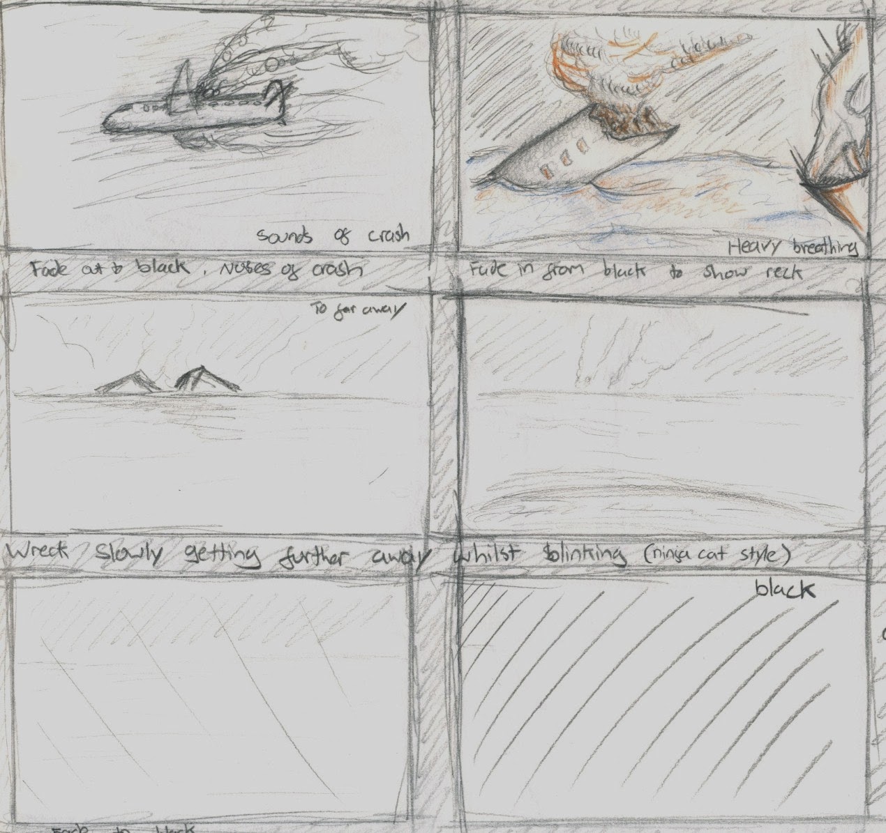
here is my second idea for water, a man crash landing into the sea and getting stranded on an island in search of water ... you can see how i was thinking too far outside the box.


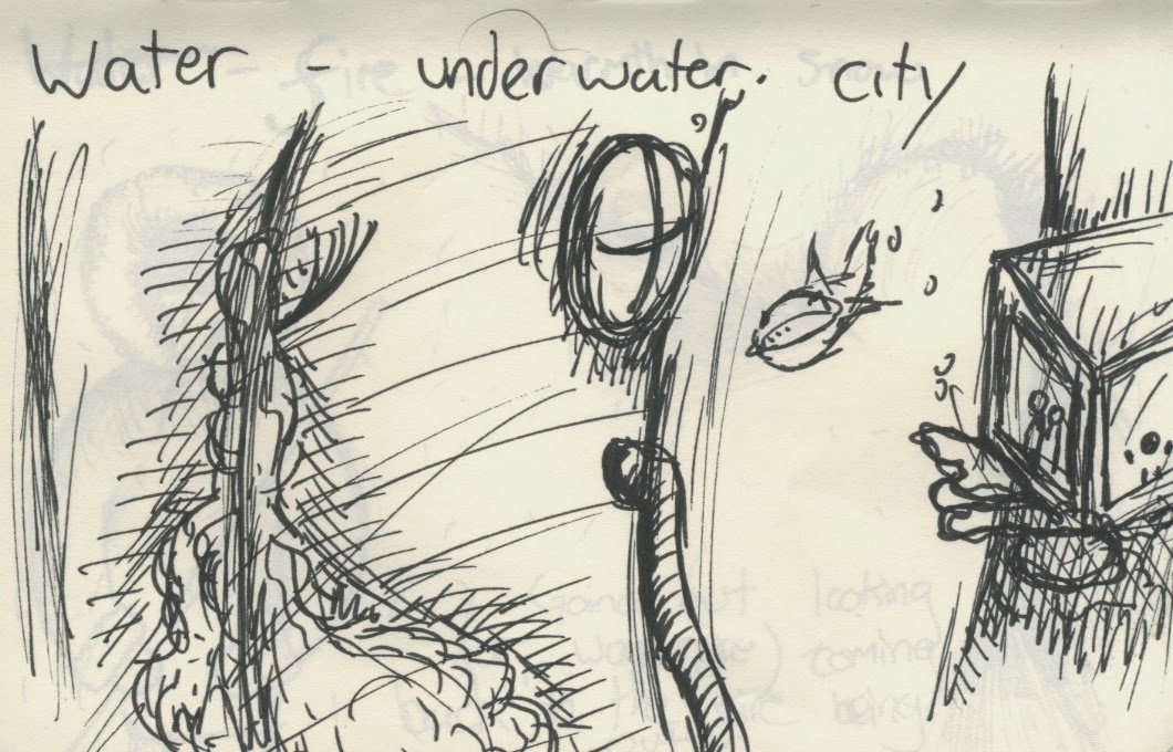
i had a brief initial idea for water, the underwater city! this became too complicated and couldn't really develop a good story.


Monday 6 January 2014

CGI


after writing about flubber the film i wrote a statement saying 'it could be one of the first films to use cgi' which struck a thought in my head, what was the FIRST film to contain cgi.

i did some research and fingers point to the 1958 film 'Vertigo' for its cgi title sequence by saul bass, some would argue its not true 'CGI' but if we break down the meaning:
computer generated imagery
and the images were created on the computer so they are technically classed as cgi.

although there wasnt much of an impact by this graphic but it did open up some doors to animators, opening there eyes to the posibility of new techniques!

spongebob can be sad


spongebob square pants - a prime example of a very wide use of exaggeration! aimed at the younger audience it has more of a right to be very over the top with its animation which is exactly what it is!

in the first season it was created using the traditional method of hand inking the individual cells which is the most time consuming way of animating, but then as the seasons developed they switched to part digital and eventually by the fifth season they went completely digital, saving them a lot of time and effort and money. it isn't very hard to notice the change either, it seems to get even more 'cartoony' which is a shame because i liked seeing the hand painted parts of the show which made it look more quirky!

this scene however is to show the power of emotion in an animation, at first i thought exaggeration was intended for a comical value but after seeing this clip i realised it can also be used in a sad scene without distracting the viewer from the emotions this scene is trying to invoke.

"He's not the messiah, he's a very naughty boy!"

         Gilliam started his career as an animator and strip cartoonist. he is the only 'non-british' member of the monty python troupe, he created the title animations for the monty python films where it was a cut out style animation which i am not a fan of really because of the lack of principles but it is very imaginative, such as pulling a head off then cracking it open like an egg which is the whole beauty of animation! the fact that if you can perceive an idea and have the software/equipment to create it you can! the only limits are your own imagination!

150 Years Ago!!


Here are two  animations, one using a phenakistoscope and the other a traditional hand drawn animation but both from the same time period, dating from around 150 years ago.
as you can see it seems like the animators struggled with secondary movement, there is very minimal principles of animation, arcs are absent as is squash and stretch.
i think they were just taken back by the actual method of animation rather than the content which is acceptable due to the fact that it is one of the earliest forms.

the phenakistoscope animation looks very much like the monty python title sequences looking very 'cut out' which i am not very fond of because i like to stick to the principles of animation. but this kind of animation ignited the flame of animation!